
Thursday, 7 May 2015
Wednesday, 6 May 2015
Magazine front cover review - Total Film

This is another example of TotalFilm. The masthead of this cover is extremely well placed and attractive, it is clear and easy to read and is obvious that it is the name of the magazine, you could say that it is covering part of the main image but it does not cover too much of the image to be a disturbance and i feel it still works well. The main image is extremely effective, the black and white works very well and captures the eye of the audience, the close up of him looking directly into the camera works well and captures you and makes you want to learn more about the image and why he is looking that way. It is a very effective image, the only issue is the color clashes in the cell lines where the text is grey, i feel it could be unclear for some people to read and could have been changed to look better as it does not give off a good look. The cell lines are well placed and do not clash with the image but could have been given a different color to grey as it is unclear to read but the ones which are white look very clear and are easy to read.
The layout of the magazine is rather conventional to what i have seen of TotalFilm they tend to have the same layout and create the same iconic layout for their magazine. With cell lines around the main image the masthead just above the image and the name of the film being displayed just below the main face of the image. The text used is extremely effective using words such as 'Exclusive' words such as this draw in the audience.
The price and issue date of the magazine is placed within the M of the masthead and this has been a pattern with film magazines such as Empire do this to. The bar code is well placed as it does not disrupt the look of the image.
Magazine front cover review - Empire

This magazine is called Empire. The Masthead is very attractive in this cover, the fire which is shown on the masthead catches the eye very well and makes you interested in what you are about to see, it helps show what you could expect to see when viewing the film shown on here 'Hellboy 2' Empire is a very well known magazine so where the masthead is slightly covered you still can tell what magazine it is by its stylistic effects to it.
The main image is extremely attractive, you can tell straight away from the image you are going to witness an action film display just from his menacing look. I extremely like this image due to the color scheme and it is very attractive and you cannot take your eye of the image and draws you in to look for more about what you are viewing. The cell lines are extremely well placed in this image and the color scheme of the text works extremely well with the image there are no clashes of colors meaning it is very easy to read. The layout of the magazine is extremely conventional adapting around the image and a clear view of what you are meant to be looking at with the main image, the text on the image is clear and shows of the film well and you know what you are viewing. The price of the magazine is between the between the masthead and is place well between the letter 'M' in between this letter you have the date, the price and the issue number of the magazine. They are all well placed and it is reasonably priced i think due to the effectiveness of the image. The use of words such as 'sneak preview' draw the audience in as they are believed to be getting exclusive information in and this is extremely effective when catching the eye of your audience. Overall i think this is a really good example of a great film magazine front cover.
Magazine front cover review - Total film

The main image of the magazine is centralized and catches the audiences eye extremely well, the colour co-ordination with the background makes the image stand out, it is a very attractive image, the pose of the actor of him in character gives a good setting of what the film going to be set time period wise and makes it seem very serious. The medium shot gives a good view of his mise-en-scene giving a good expectation of what to see within the film shown. The image is extremely effective as it is a professional well known actor and you know it is an actor from the film 'Sherlock Holmes'.
The layout of the magazine is very conventional with a main image and cell lines surrounding the image giving a eye on the image and capturing the eye of the viewer with its bright text. The bar code is aside of the image and is out the way but still in clear view. It is very cleverly placed and does not effect the attractiveness of the image like it could if it was placed closer to the actors face in the main image. The price of the magazine is very small on this and is quite expensive, it could be changed in size to make more visible but is still in the right area just text size needs to be changed to made more clear.
Sell lines are placed very well and are clear on the page and do not overlap with the main image creating an attractive page to look at. They use catching words to a buyer such as 'Extra' and these words will draw in a viewer as you are more likely to be interested in something if it is exclusive. The pull quote which has been used is very catching and interesting 'All the elements are coming together!' This shows that it is going to be an Adventure film and the magazine is showing this with that quote, it is a very smart quote to use and the image helps represent the investigator of the matter making it more clear.
Tuesday, 5 May 2015
Additional shots for our Film Trailer after Storyboard
When we looked through our animatic we realized we needed a few more scary shots to make the horror of the trailer stand out more. I found this trailer and showed it to my group as we are looking for more possession within our trailer to link up to the film plot and this film had great shots showing distress of people and also some very disturbing shots
https://www.youtube.com/watch?v=8TgHldrvLrA
This helped us gain a better attraction to the horror audience.
We took shots of people looking frantic and used the shot where the toy rolls over on its own which is very eerie and creates a awkward feeling, we are using the scene where the child looks isolated on its own and said 'Mommy' and the shot of the women frantically digging at the dirt but linking it to ours we are using it as her scratching through the dirt and ashes which smashed on the ground to realize the demon inside of her.
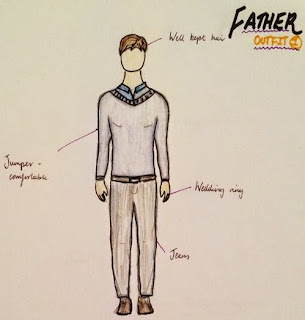
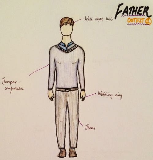
Costume Ideas for the film trailer
As a group we came together and thought through what would be the best design ideas for the trailer. We all said our ideas in class of what we would like and then designed them up and got a few drafts of ideas we would like to put forward and see in our trailer. We wanted to show each side of a character with more than one example of what they are wearing for example what they would wear during the night and during the day to get both sides of what is happening.
Here are the examples for the mother:


Here are the examples for the mother:


Here are the examples for the son:


Here is the example for the father:

Animatic review
An animatic is a pictures in a set order which is to display how a film trailer may be portrayed to an audience. It is to see whether shots will flow well and whether pace of shots will be good and whether certain editing techniques will be needed during the actually plotting of the film. The animatic which we created was a good help to find what would work well and wouldn’t work within the film trailer.
We created a narrative within my group’s animatic by giving a clear representation of who the family is through close scenes of the family together, this then is followed by shots leading up to the break of the equilibrium where you start to see the narrative of the film start to break down and go into a more physiological break where it takes a lot of thinking and patience with the trailer to get a clear understand of what is happening. As with most physiological horrors we tried to encourage the sense of realism within the family’s everyday lifestyle to create the higher sense of narrative that they are just a normal family, obviously this is seen to change throughout the time of the film trailer. The story boarding which we did helped us a lot with gaining a better sense of narrative because you could see which order would tell more of a story giving us a better view of what would work and what wouldn’t work before we went out to take images.
With making the animatic we had a very set date which we was all able to make and it was very organized, we all kept in contact and made sure that everything was prepped ready for the date so we would hopefully get It all done in one session which was overall a success. We did not 100% follow the storyboard shot for shot when we was working it was working with what we would do with the lighting situation and working around it which I felt as a group we all handle very well giving us plenty of time to spare in the end. We had to shoot in two locations which was at Alys’s house and in the barn next to her house. These were both easy accessible and fitted well with the theme of our plot. The house was great to work with as it had everything we needed to make it seem like an everyday couple moving into a quiet house and the barn was very eerie and creepy making it perfect for its representation throughout this film trailer as being the main area of action with possession. The props which we used were all well chose by the group as we all went out to find these props such as ‘teddy’ which was used throughout as the child’s toy but also representing possession as the film trailer is to go on; the ‘china piece’ this was to break and this is for the witch to be realised, we chose the piece well together and thought that the stylistic effects of it looking old was edited by Alys extremely well. The characters which we had to play our father, mother and son during our animatic was Luke as the father and Alys as the mother, I feel that they worked extremely well together as they have done drama projects in the past together so they have a good connection with each other which can also been seen through the pictures took. We did not have someone the suitable age for our kid so we had Dora to play the son, she did a good job of representing the main images of the boy which was to look isolated and overpowered by the mother. We did not take any additional shots during the making of the animatic which I feel could have been changed but shots were becoming too complicated with matters of lighting with it becoming dark and the availability of lifts back to each other’s houses.
During the editing process it was rather straight forward as we had previously talked through what we would like to happen during it so the effects with adding fades to black and whether to fade in and out was already decided so it was a matter of adding them, we did have a few things we wanted to change whilst we was in there as it was noticeable that they did not work as we suspected but we worked together and came to an agreement on other things which could be added to replace the things which did not work. The length of shots were decided at the making of the story board so we had a clear idea of what we wanted to create and we followed that through.
The choice of titles and intertitles were discussed together whilst we was planning the storyboard, we came up with a few examples and decided what were our favourite and went with them. The texts and size we used was important as we wanted it to stand off the page so that it would engage the viewer to read and hopefully gain further understanding into the narrative. An example of one of our intertitles is ‘Fear her’ this signifies that the mother is changing into something scary and that she should be feared. This is played during the change of her between possessed and fight the possession so it shows that she is dangerous.
The soundtrack was suitable for our trailer but I feel that it could have been more intense at parts as it did not give that huge sense of fear which you were meant to have during the fast cut sense. Representation wise during the narrative I feel that it was a good pace but it would have been better when the pace was needed to pick up. The pace of the editing was quite towards the fast cuts but the music was a bit off and a little syncing was needed so it would have fitted better to the clips which was playing but overall I believe it was a good starting point and it shows we were going in the right direction and that it was a good idea of how we can develop our ideas as a group and link better when it comes to the real thing. I personally think that we did not hit the target audience well enough. There was not enough shots which physically stood out as a viewer myself, the main iconic images were Alys playing the mother on the chair possessed, the child having the knife to the neck, child in the corner extremely isolated. Other than that it did not have a huge fear factor. As much as this was a learning curve I believe that we will need to develop a few more scary shots to hit our audience better.
The main changes which I would make to the trailer would be to include more iconic horror images of the child and mother both in uncomfortable situations and more jump scares, but then to match this the soundtrack has to also be worked on to suit the shots which are taken. I do feel as a group we all worked well and was organised for the task. We all was ready and prepared and knew our rolls and stuck to them well. As a group I do not have any issues with anything at this moment in time. I do believe that the location, time and setting is all very good for what we are trying to create. The area looks quite isolated so it suits the feel which is created throughout the narrative.
I feel as my roll I couldn’t play a physical part during the actually filming so I was the camera during the actually filming of the animatic and I feel I did my part to give input when shots were being taken so each shot was as intended on the story board. I was also in charge of finding the name of ‘Delirium’ which is another term for insanity which interlinks with basis of our film with possession and the lead to insanity of the mother. I also had quite a bit to help out with the editing process of the animatic. I showed the others how to use the software we was provided and let them do some so we all had an equal input to the film, we all had our rolls and stuck to them well and I feel as a group overall we worked really well together and that we will now take what we have learnt front this and put it into our actual film trailer.
Story board
Here is the main ideas of what we have created for our story board, we designed this over a number of lessons and try to come up with creative ideas to match up shot for shot what we would like to display within our trailer. With our plot which we all drafted together creating new ideas from our own and changing them to create a new plot together these are the main ideas we have created for a shot for shot bring down of what we would like to create in a full complete trailer
at the end of this process
.


.


Subscribe to:
Comments (Atom)